

Imagine you clicked on a website and its homepage has a poor UI/UX. You’re finding it extremely difficult to navigate through this website, there are no clear CTAs, no visual appeal, and no clear categorization of products or services. You may immediately exit the website, only because of a shabby homepage.
Homepages form the core of your website. They are the gateposts of your business to your target audience. Instead of treating them as another landing page serving a category of audience, you need to make it versatile to serve different categories of audiences from various backgrounds.
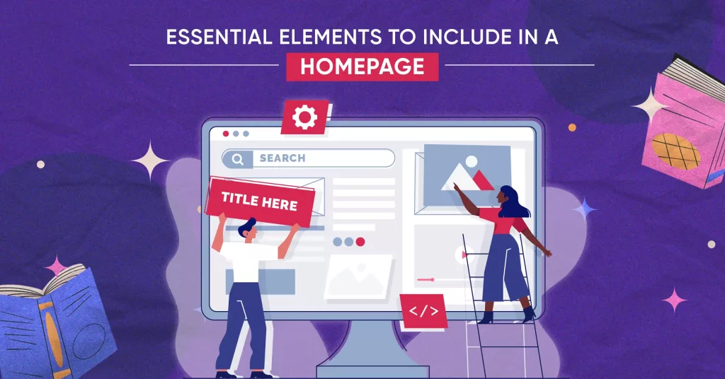
Here are the 11 essential elements that must be included in your homepage for it to stand apart!
- Logo
- Call to Action
- Intuitive Navigation to Other Pages
- Social Proof/ Testimonials
- Value Proposition
- Overview of Service & Features
- Photos
- Contact Information
- Banners (If it is an eCommerce Website)
- Product Categories (If it is an eCommerce Website)
- Footer Section
Logo
Let’s see how quickly you guess these:
- A logo with an arrow from A to Z.
- A logo that stirred controversy for allegedly being offensive and insulting towards women.
If you guessed them, congrats! For those who didn’t, we were referring to the logos of Amazon and Myntra.
Logos are a crucial element of your branding effort. At times, the user may not remember your taglines or name (if it’s difficult to pronounce) but they’ll definitely identify your brand by its logo.
If you look clearly at the above image, you can see the (revised) Myntra logo on the top left corner of the page.
Keep in mind that there’s no compulsion to place your brand’s logo in the top left corner. You can even align it in the center of the page. But, make sure that wherever you keep it, it should be easy to spot and visible enough.
Call to Action
Another essential homepage element is the CTA. The homepage of your website will serve its purpose (of making the user dig deeper into the web) only when it has a clear CTA. There’s no point in having a visually attractive website without a CTA.
A CTA can be any action that you want the user to take. “Buy Now”, “Sign Me Up”, or “Get a free Ebook” are all examples of CTA.
Make sure that your CTA aligns with your brand’s objectives. If you’re an EdTech company offering online coaching services for competitive exams, it’s better to offer free trials, study materials, links to newsletters, community groups, etc. to bottle the user into the sales funnel.
So, where do you put the CTA? Keep in mind, that wherever you keep the CTA, it must be easy to locate, distinct, and large enough.
And how many CTAs could you put in a home page? It depends on you, you can keep one primary CTA or have a combination of primary and secondary CTAs.
Intuitive Navigation to Other Pages
The homepage must be designed to facilitate smooth navigation on your website. How?
Let’s take the example of our own homepage:
You can see that in the top right corner, we’ve offered quick links to our various pages right from services that we offer to how to contact us. Even when you scroll down the page, that menu bar will be available and will quickly take you to your desired page within a few seconds. This eases the navigation process for our users.
Social Proof/ Testimonials
Suppose, you’re a marketing agency offering top-notch digital marketing services to B2C companies. If you claim on your home page that you’re the best marketing agency in this domain (you have rights to), people are most likely to discredit your claim. Why? Well, they would assume it’s a typical marketing gimmick.
But on the other hand, you write something like this in your web copy:
“We are a dedicated group of professionals offering digital marketing solutions to B2C companies exclusively in India. Over 12 years of experience, we’ve skyrocketed 1000+ businesses” (P.S. It’s just an example). Next, you substantiate your claim, by offering key client testimonials, with their photos, images, or even videos.
Which do you feel is more intriguing for a user?
We bet on the second one. Why? Because there you’re not just making a claim but by substantiating your point, you’re showing your credibility in the industry. Moreover, word-of-mouth marketing, even in the digital world, does wonders.
Value Proposition
You need to clearly tell your visitors what your company does, for whom, and how on your homepage. This might sound simple, but a lot of businesses make a grave mistake here.
Let’s take an example of Zomato here:
In the above image, you can see that Zomato offers three facilities in Mumbai, traditional doorstep delivery, restaurant reviews and bookings, and lastly, an overview of the best nightclubs in the city.
In short, don’t beat around the bush and offer actual value to your customers on your homepage.
Overview of Service & Features
Although offering an elaborate overview of your products and services is not feasible, you can shorten it into viable chunks and present it on the homepage.
You can give a basic overview of the services such that a user gets the basic information. You can then place a CTA that redirects user to the particular service page.
Photos
The old saying that a picture is worth a thousand words stands true even in the digital era. Thus, your homepage must have a visual appeal. It must have pictures or short videos that align with your business.
You can use your creativity and place the pics either at the top of the page or towards the bottom so that the image is only available for those who have spent a few minutes on your website and are likely intrigued with your content. Make sure that the photos and videos you put on the homepage are quick and easy to load otherwise it won’t serve the purpose.
Contact Information
No matter what products or services you offer, users are bound to have some queries related to it. If there’s no clear contact information provided, it will be counterproductive for your business. Thus, providing contact information on the homepage is a must. You can put a Contact Us tab on the topmost bar (as Eiosys did) or you can provide a Contact Form towards the bottom of the page to allow visitors to connect with you.
Banners (If it is an eCommerce Website)
The homepage introduces your business to users and what better way than enticing them with sales, hot deals, offers, and coupon codes? Let’s see an example:
The moment you click on Myntra’s website you come across the sale details as well the the first purchase offer. If a first-time user comes across this, they’ll likely be tempted to download the app and avail the offers. That’s the power of putting banners on home pages.
If you run a D2C brand, placing banners on above the fold section of your homepage can also help you earn quick sales and increase the chances of conversion. The banner should have a neat image, offer pricing or any newly launched product detail along with a well-defined CTA.
Product Categories (If it is an eCommerce Website)
eCommerce websites have an abundance of products to offer. Thus, having a clear-cut product category on the homepage itself is crucial. It will ease the navigation process for your users by leaps and bounds.
Take this example of Flipkart:
In the above image, you can see various categories of products from groceries to electronics, home appliances, and even motorcycles.
Footer Section
Although the bottom-most element of your home page, the footer section can serve an important function.
Let’s take our example once again to understand this:
As you can see, the footer section includes a sitemap and a list of almost all pages on the website. It contains navigation links to essential site sections, such as Contact and Services. Contact information like addresses and phone numbers is often present. Legal details like copyright notices, Privacy Policy, and Terms of Service links are included.
Thus, don’t underestimate the footer section
Conclusion
To sum up, homepages are dealmakers or deal breakers for any online business. To make the maximum use of homepages, and to lower your bounce rate, you must include the elements discussed in this blog on the homepage of your website.
If you are looking for a website development company in Mumbai, or web maintenance services, we’re just one click away! Contact Us Today and Give Wings to Your Business.