


Does your inner Picasso rise at the sight of your website’s white space? Fill in the blank canvas!
Choosing from a thousand different colors can be difficult, so let’s lock a color scheme first. To begin with, a website colour scheme is the set of colours you choose, as a designer, for the website design. Also known as colour palettes, colour schemes typically include two sets of colours: primary and secondary.
Primary colours are usually the more dominant colours occupied by the background, menu or logo colours whereas secondary colours account for accent uses and the like. A colour palette may also include several shades of the same colour family, resulting in variety yet consistency throughout the design. Even with website colour schemes, consistency is key.
Brand personality is integral to the success of the website and the business. With repeated use of colours and styling, the audience will create an association with the brand. A consistent website color palette, thus, solidifies your brand identity with flying colours!
1. Visual Medium
Website colours are crucial as they become your visual identity. The visitors and prospective customers on your website perceive the colours in resonance with your brand.
Also known as brand recognition, such visual identity transpires as a medium of communication between you and your target audience as various types of colour palettes speak to different user personas. Research conducted in 2018 proves that 94% of respondents claimed to have their first impressions of a website to be design-related. And the colour palette plays a huge role in design.
2. Brand Recognition

Consistent use of the same colour schemes across business materials creates an association of the colour with the brand. Repetition of such an association makes it more likely for customers to remember and recognize the brand.
For instance, it was found that 91% of people recognised Google simply the colours in the logo. A definite, consistent colour scheme helps customers grasp your brand’s messages across different platforms, link advertisements and promotions back to the brand and further develop their brand understanding.
3. Highlights Details

Incorporating a few contrasting colours in the colour scheme helps highlight specific important areas of the website, such as a CTA button. With contrasting input, the website also looks more organized and helps users distinguish among different components of the page.
A side column informing about a particular offer or event highlighted with a sharply contrasting colour, for instance, can encourage people to look more closely. The colours you choose can make the page easier to navigate, and read and direct people towards key parts or pages of the website that lead to converts.
4. Emotional Connection

Colour psychology states that different colour schemes trigger different emotions and associations among people.
For example, some colours might elicit feelings of joy or urgency. To begin with, colour psychology distinguishes colours into two main categories: warm and cool. Warm colours, such as reds, yellows and oranges, encourage warm emotions that vary on the scale of comfort to anger.
Cool colours such as greens, blues and purples encourage cool emotions that vary on the scale of peace to melancholy. Colours determine the tone and voice of the website and actively affect the conversation with your audience
5. Choose Your Brand Aesthetic First
Consider your brand’s aesthetic and choose the website color combination that you want your brand to be defined by. Remember that with repetitive branding for customers, these colours will be associated with your brand. A business working to signify modern and sleek through its colors would not go well with a website full of extra content. The clutter makes the website appear a little too busy and shadows essential information.
Website content should be easy to navigate for users, such that they land on the pages they are looking for. With a good structure in mind that combines the right language and imagery, choosing website colours will be a lot more trouble-free.
6. Check Out the Competition

To keep ahead of the game, learn about the market’s current status and your fellow competitors. Understand the features of other websites and how they prove beneficial to the business as well as the different colour combinations used across the website and the visual difference they make. Figure what can be done differently with your website and understand why (if) it has not been done before.
For example, it is expected of a health-centered website to use the colour green because of its association with nature and health. However, a health brand with a red colour scheme will undoubtedly stand out among its green competitors. The key is to stand out in a good way – an ability that can be mastered with time and practice.
7. Consider your Target Audience

Different colours can have different associations in diverse contexts and cultures. To choose the colours that are perceived the way you intended, understand your target audience. While choosing the colours, one must keep in mind that colour schemes also visualise the brand’s message.
The target audience will be drawn by the right colours aligning with the brand. For example, a website focusing on products for babies might opt for pastel colours to demonstrate fragility and care. Such colours will speak well with new parents than brighter shades of orange or red. Thus, the colours must not only be in line with the brand but also meet the beliefs of the target audience.
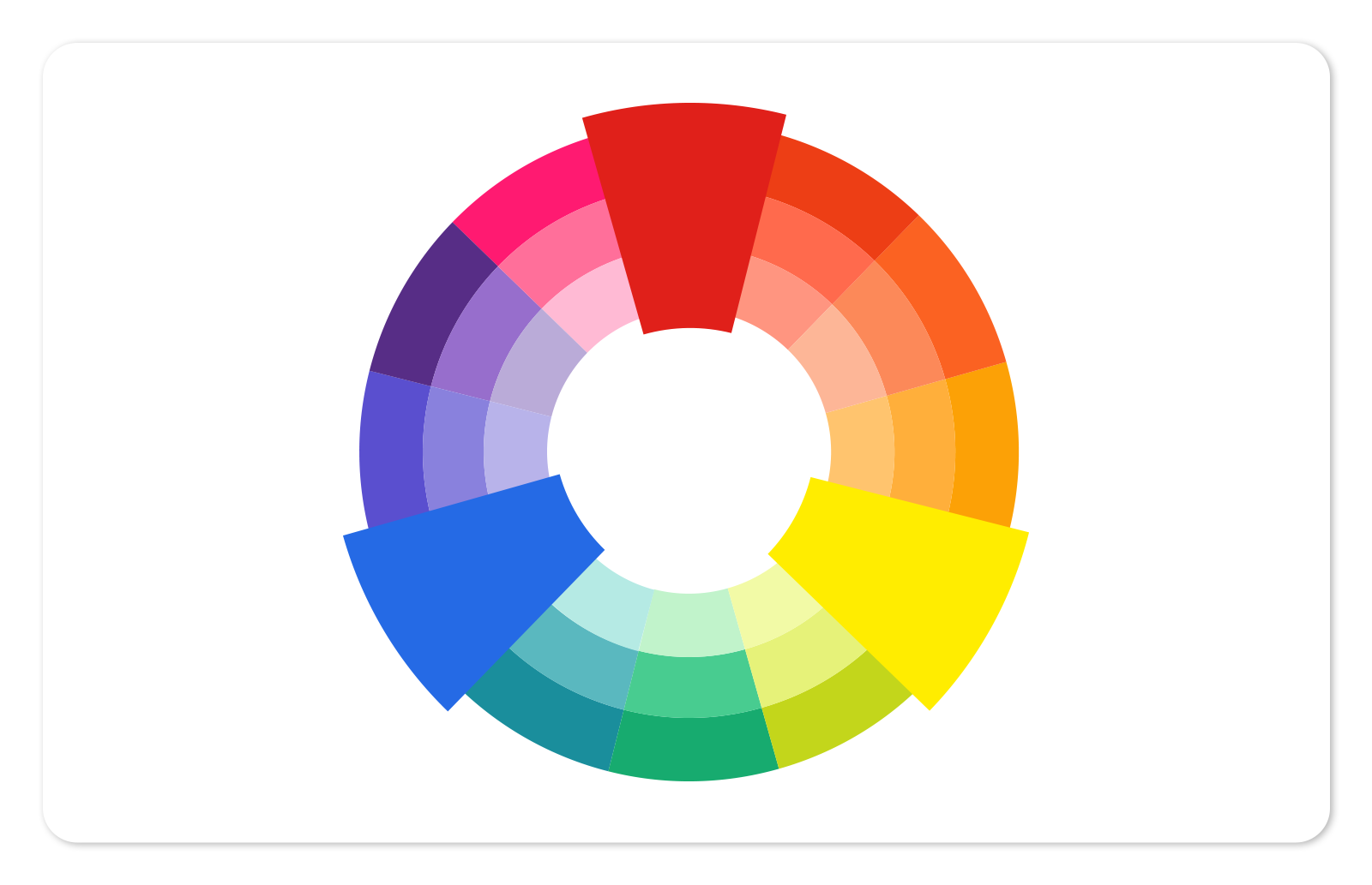
8. Study the Colour Wheel
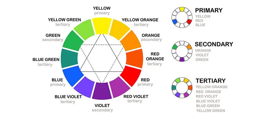
Let’s start with the basics of the colour wheel. It comprises three groups: primary, secondary and tertiary colours. The base colours, otherwise known as the primary colours are red, blue and yellow, rest all of the colours are obtained from these three.
When any of the primary colours are mixed together, secondary colours are born such as orange, green and purple. Furthermore, bringing together colours of primary and secondary each gives you tertiary colours. Now that we have established how colours are formed, we can understand how they interact and work with each other. Together, the colour wheel can have a variety of colour combinations as you will see below.
9. Understand Colour Psychology
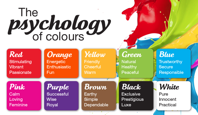
Hold your intellectual breath as we dive into this topic! Colour psychology is a phenomenon built around the idea that colours trigger specific feelings and emotions which further trigger particular courses of action. While feelings and emotions may sound wishy-washy in a business context, in reality, they play an integral role in branding, marketing and sales.
Emotions are at the core of a consumer’s decision-making process. Choosing your website colour scheme based on the emotional experience you intend to deliver is proven to not only impact the brand’s personality but also evoke certain visitor reactions depending on the emotional environment you create. Colours can have many different meanings based on the context they are used in. To find the colour most appropriate for your website, it is important to first understand what it symbolizes.
From the wide range of shades to choose from, it is no cakewalk to find what works for you. Use colour psychology as your guiding principle and make informed decisions in choosing your colour palette by focusing on the style and theme that best suit your business and industry.
10. Incorporate Neutral Colours
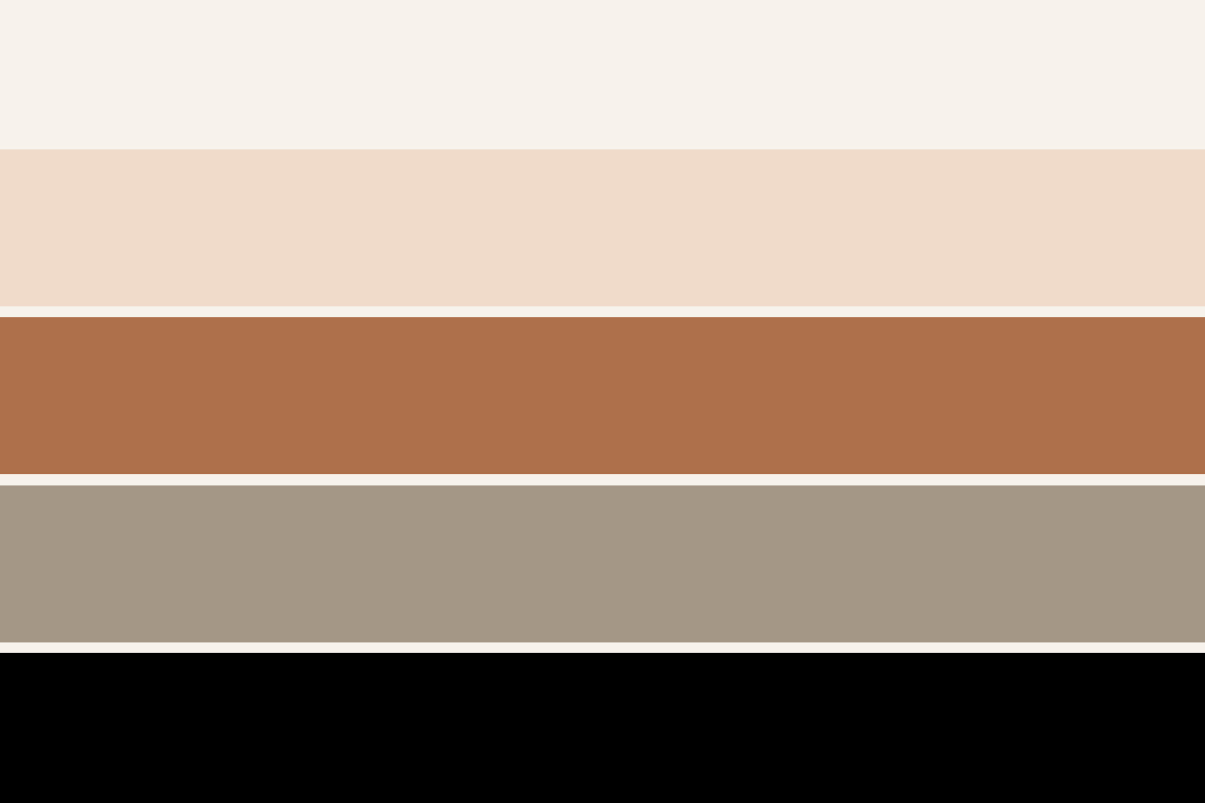
Although neutral colours may not be compelling at first, they become a necessity for an intricately made website colour palette. Be it for minimal text elements or half of the background, neutral colours are essential to maintain a balance of colours. The visual stimulation induced by non-neutral colours, along with the qualitative information, can be too much to process at a time. Neutral shades like white, cream, beige, brown, taupe, gray and black add a composed essence and keep the website mellow. A website with a seemingly dark palette can benefit from using lighter neutral colours as it can enhance the CTA buttons, navigation bar, menu or logo provided it is used correctly.
11. Explore Colour Combinations
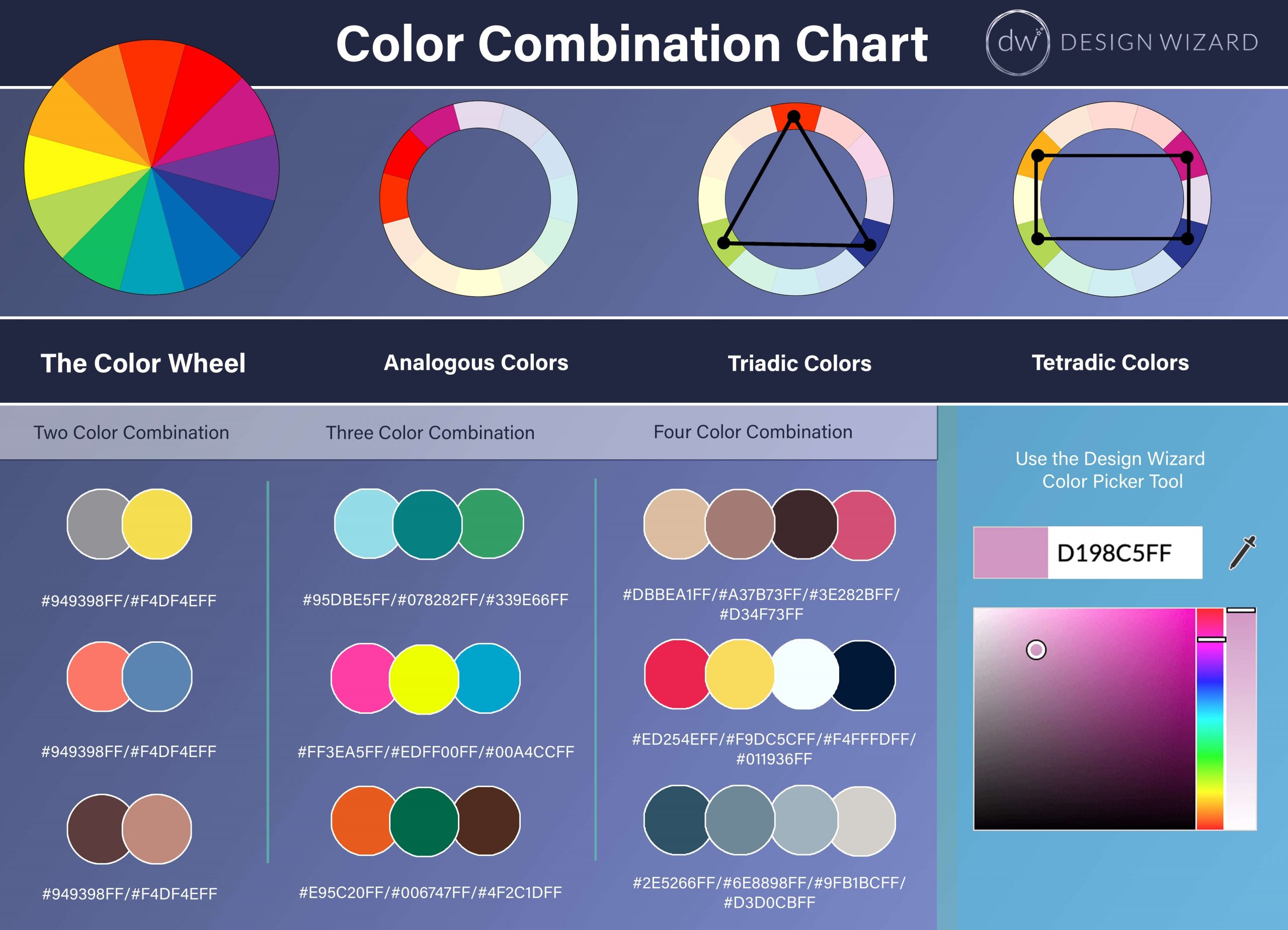
A colour palette is an appealing combination of colours. The types of colour combinations are as follows:
- Monochromatic: As mono (meaning one) suggests, monochromatic combinations are based on a single hue. The colour palette will be made up of primary or secondary colours such as blue along with a set of tints, shades and tones from the same colour family. Monochromatic colours are a green signal in terms of visual appeal. To add flavour, create enough contrast for legibility.
- Complementary: Opposites do attract, at least in our colour wheel. Complementary colour palettes exist on opposite ends of the wheel, like red and blue. These colours contrast and complement each other. The contrast, however, can be quite strong and should be used intentionally to ensure that the colours are not too intrusive. Complementary colours work wonders for elements such as the navigation menu or other buttons.
- Analogous: Colours that sit together, form schemes together! The analogous combination is made up of three colours that exist alongside each other on the 12-spoke colour wheel, such as red, red-orange and light orange. This combination is used to create a modern yet suave website. Although quite visually appealing, like monochromatic combinations, these colour schemes should add contrast to maintain legibility.
- Triadic: A triadic colour scheme comprises any three evenly spaced colours located 120° from each other. One of the more flexible combinations, triadic, allows you numerous directions to choose and measure 120° from. Triadic can be seen as a mix of analogous and complementary combinations and still leaving room for more creativity. An example of a triadic combination is orange, purple, and green.
- Compound: Also known as a split complementary scheme, a compound combination starts off as complementary with the first shade, and splits two ways on the opposite end resulting in a combination of three colours. A contrast is softer than the complementary scheme is created and allows for more diversity. An example of compound combination is orange, purple, and teal.
12. Choose the Primary Colour
A primary colour is the star of the website, as this colour will be dominantly featured on your website. Start with picking a primary colour. According to the 60/30/10 rule, the primary colour accounts for 60% of the website colours. Primary colours are quite strong in themselves, thus, it is necessary to consider colour psychology and the context. Use the colour that sends out the emotions you want the users to perceive after they land on the website. Contextually added colours work better for the audience.
13. Add Contrast to Your Palette

After locking your primary colour, select a secondary colour or two. According to the 60/30/10 rule, secondary colours account for 30% of the website colours. Understand what colour combinations from the five we mentioned above work best for the website. Colour psychology is relevant here as well. Soft colours, such as pastels, convey a message much differently than vibrant colours. Whether you want the colours to look playful and exciting or calm and relaxing will determine your colour palette.
14. What’s Your Accent?
To account for the 10% in the 60/30/10 rule, accent colours are mandatory and used sparingly throughout the website. The accent colours often strongly contrast against the primary colour. The accent colour stands out with the help of this contrast and draws attention to important elements of the page, such as CTA buttons. Any colour can work well as accent colours as long as they add some amount of contrast to the rest of the colour scheme. Black and white too are effective accent colours, especially on colourful websites.
15. Consider Visual Hierarchy
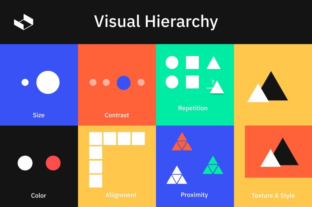
When it comes to visual hierarchy, your colour palette is the most defining element on your website. This stands true for the colours you choose for the buttons, the background, the text, etc. With a headline in place along with a small, descriptive body of text, your choice of font colours becomes as critical as your choice of background colour. If the two pieces of text are assigned different colours, such as the headline in a dark colour and the subheading in a lighter shade, it is easier to view each in its own light in comparison to using the same colour for both elements. Along with text colours, background colours and buttons are crucial visual elements too. To shed light on a particular button, choose a colour more likely to draw attention and consequently yield a higher conversion rate.
16. Focus on Clickability

While a visually appealing palette is significant to website design, the way that a website color palette affects user experience is equally important. Your website’s colour combination majorly helps determine a certain course of action the user will take. Use the palette wisely, such that the text is not only legible, but accentuated by the background colour. With the right contrast, you can create a powerful colour scheme carefully designed to increase clickability. You can also choose multiple tints of the same colour and apply them to elements across the website in order to demonstrate the relationship between those elements while maintaining a hierarchy of importance in the content. The key is to use the colour scheme to your benefit by making the visual more easy and understandable yet extraordinary enough to speak to the users.
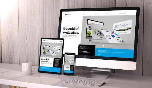
17. A Responsive Design

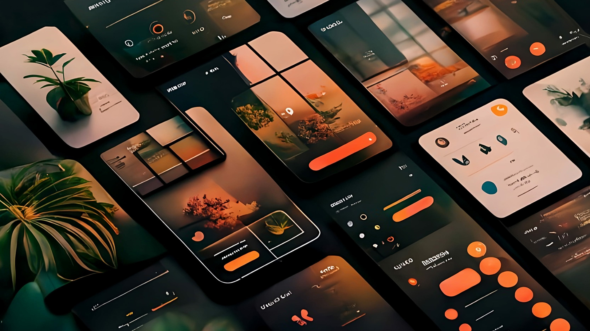
Not only the size and layout of the website but the choice of the website color combination also determines how a website will look on multiple devices. When creating a responsive design, the design process becomes easier as the textual components remain legible irrespective of the screen size. Similarly, icons and buttons are just as clearly visible on both devices.
Since mobile screens are much smaller than desktops, they demand fewer colours to avoid over-saturating the website. Thus, you must also consider responsiveness while choosing your colour palette. Alternatively, you can opt for a monochromatic scheme for the smaller interface of mobile phones. The different shades will add variety to the website colours, yet maintain a view tidy and cohesive enough.
18. Test Colour Scheme Across Devices

Last but not the least, test your website color combination across various devices. Observe how it is displayed on mobile phones, desktops and any device the customers may use to engage with your website. You will gain insight into how the website color palette promotes your brand. Once the website colours are live, observe and measure the response of your target audience, the impact on conversions, the number of website visitors, website interest and other such performance indicators to understand brand engagement. All this talk of colours surely added more colour to our understanding of websites! The idea behind the variety of colours used in texts, buttons or the background has changed the way we look at websites. The right colour palette surely does help up your business game, by making the website more interactive and user-friendly.
We have already helped you figure out how to choose the colours for your website; our folks can also help you develop your website or a mobile app and reach your business goals!